July 15th, 2025
Improved
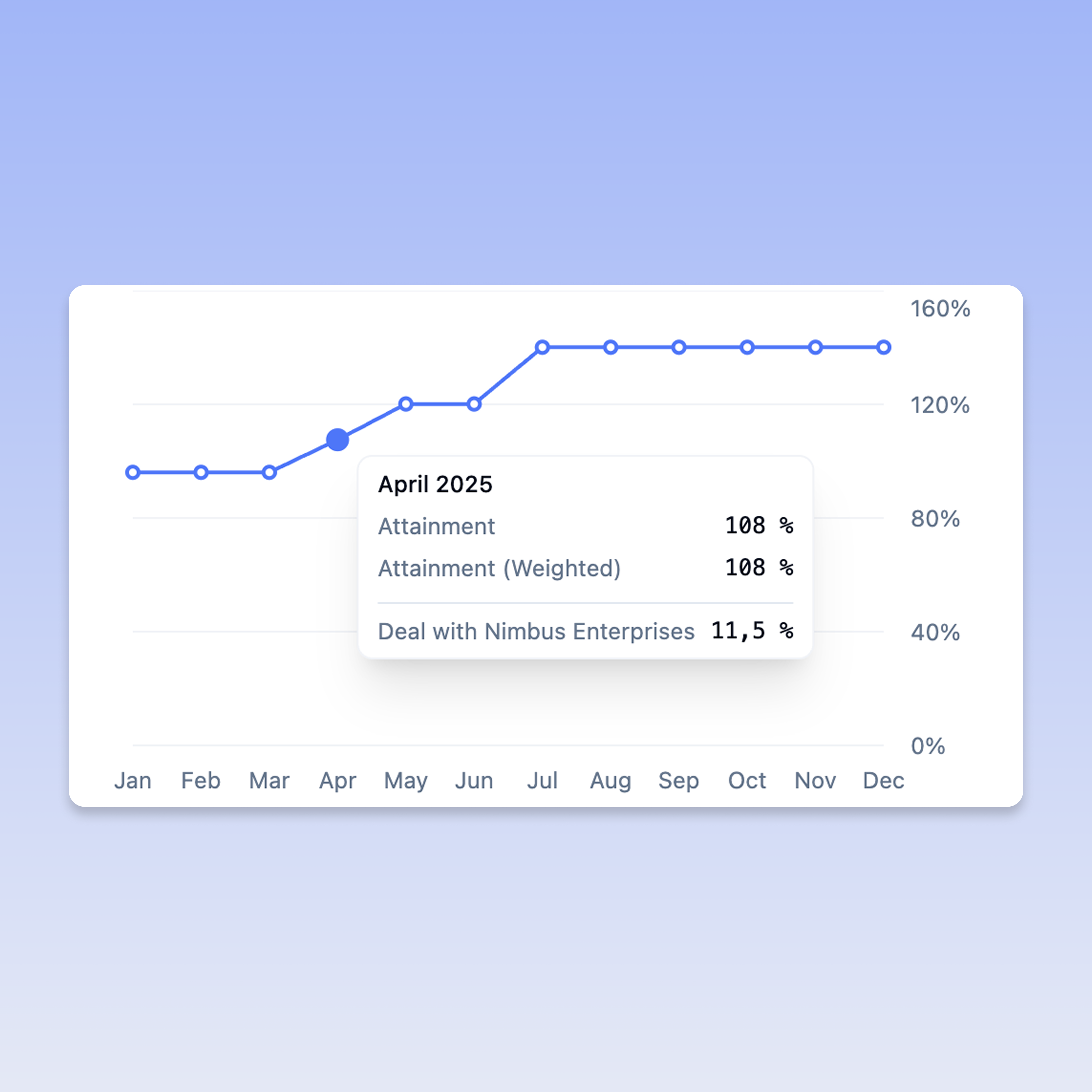
📈 Visual Attainment Charts
Release Date: Juli 15, 2025
What's New
We're excited to introduce Visual Attainment Charts in Centify! This powerful visualization feature provides clear, graphical insights into deal attainment progress, making it easier than ever to track performance against targets.
Key Features
📊 Interactive Attainment Visualization
Beautiful line charts showing attainment progress over time
Real-time updates as deals progress through your pipeline
Clean, professional design optimized for performance tracking
📱 Navigation
New "Chart" tab added to the Attainments section
Seamless switching between Overview, Deals, and Chart views
Deal count indicators for quick reference
How It Works
Navigate to Attainments: Access your attainments as usual
Select Chart Tab: Click on the new "Chart" tab to view your visual progress
Analyze Performance: Review your attainment curve and identify trends
Track Progress: Hover on the chart to get detailed insights
Benefits for Your Business
🔍 Enhanced Visibility
Instantly see performance trends and patterns
Identify successful periods and areas for improvement
Visual confirmation of progress toward targets
⚡ Faster Decision Making
Quick visual assessment of attainment status
Spot performance trends at a glance
Better forecasting based on historical progression
📊 Improved Reporting
Professional charts perfect for stakeholder presentations
Clear visual evidence of team performance
Easy-to-understand progress indicators
Pro Tip: Use the Chart view during team meetings and performance reviews to provide clear visual context for discussions.
Technical Notes
Charts render in real-time based on your latest deal data
Responsive design works perfectly on all device sizes
No impact on existing attainment calculations or workflows
Feedback
We'd love to see how Visual Attainment Charts help you track and communicate performance! Share your feedback with our product team through the in-app feedback widget.
Questions? Check out our Help Center or contact support for assistance with the new Visual Attainment Charts feature.